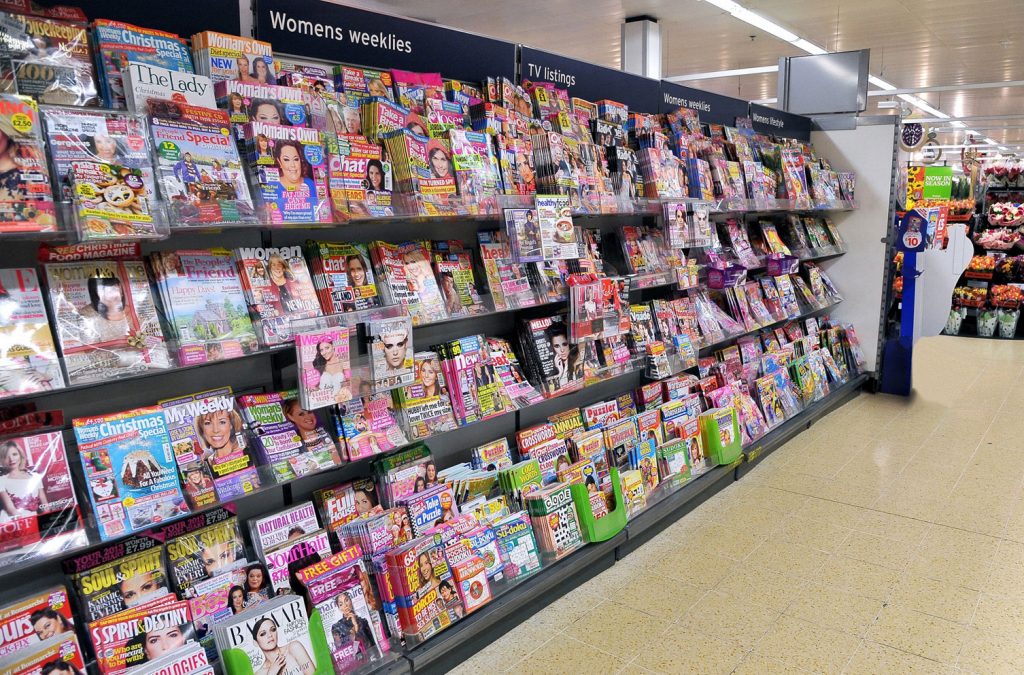
The third Monday in January or, Blue Monday, has been bannered as ‘the most depressing day of the year’, taking into account a raft of factors including weather conditions, low motivation and the psychological impact of already broken New Years resolutions. But what impact does the colour blue actually have on shoppers at the newsstand?
Despite it being associated with sadness, misery and woe (since at least the 17th century) – the colour blue is still ‘arguably the most popular choice for a brand colour’. It can actually evoke feelings of reliability, authority, trustworthiness and tranquillity. It’s dependable, and is linked more to intellect and consciousness than most other colours – which might be why it is consistently ranked as the world’s favourite colour.
Colour research is a very interesting area of consumer behaviour to explore. As different colours evoke different sentiments and feelings, its important to consider what messages your covers are subconsciously portraying. Some cultures view colour associations differently too, so researching the ‘appropriateness’ of your choices across varying markets may be important in some instances – especially if considering local language editions. With “60% of shoppers deciding whether or not they’re attracted to a message based on colour alone”, ensuring you’ve made the right connection between intent and delivery is key.
Our Marketing Services team produce an array of interesting and thought-provoking reports each year specifically targeted to enhance the sales potential of the wider magazine category. If you’re interested in learning more about the impact colour plays or how this may affect your performance on the newsstand, feel free to get in touch with us at [email protected]
Sources: Marketforce Impact of Colour Research Report 2023

